You'll never catch me intentionally designing an app with a tab bar. It's my least favorite interface paradigm.
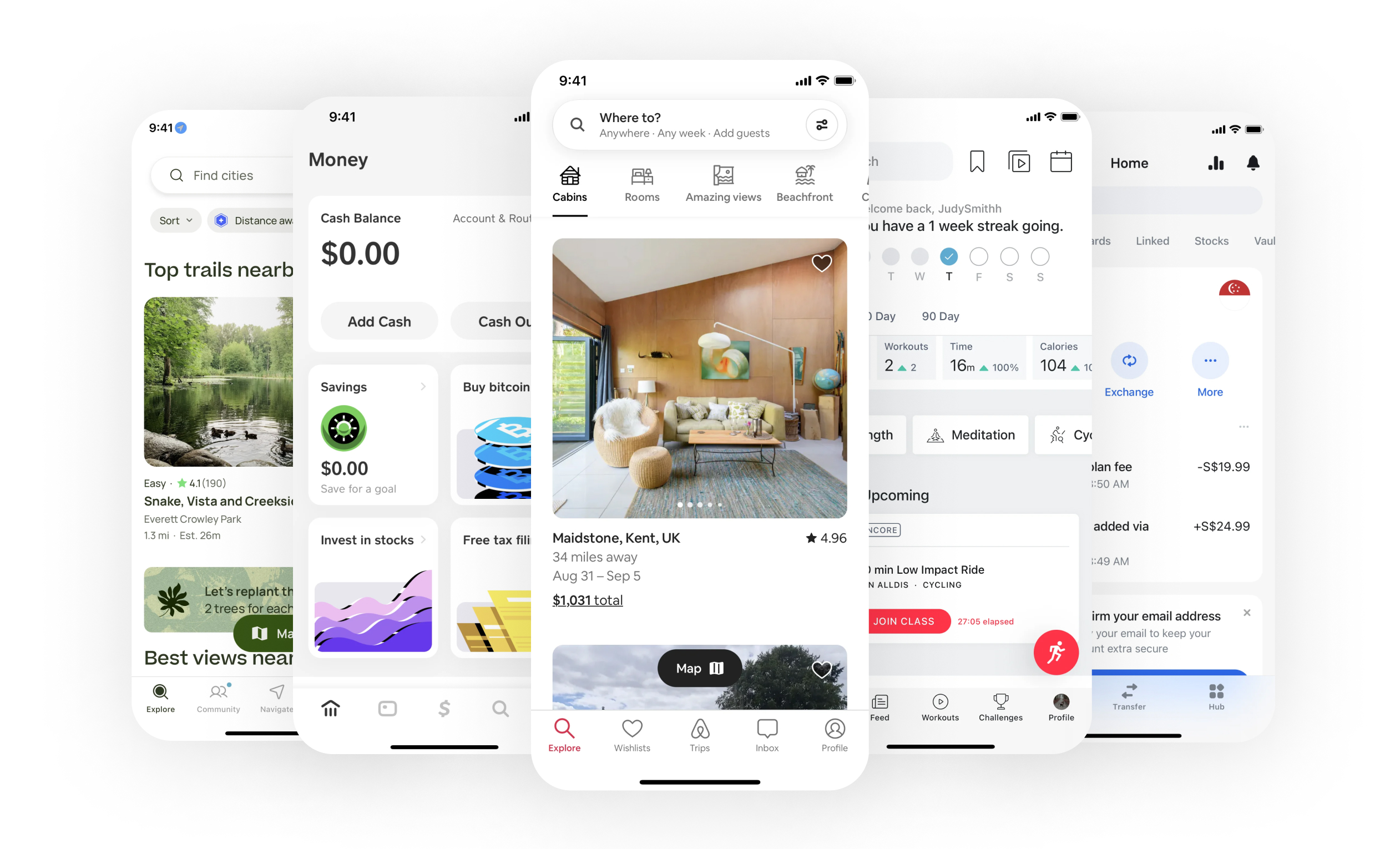
tabssssssss
Mobile interfaces are like homes.
With your fingers, count the number of two-story homes where the staircase wasn't visible from the front entrance. I'm guessing not many.
There are various reasons for this design choice, but the most significant is that the staircase serves as a context clue. Intuitively, we associate it with leading to the bedroom or other private spaces. We might not know for certain, but the context suggests it.
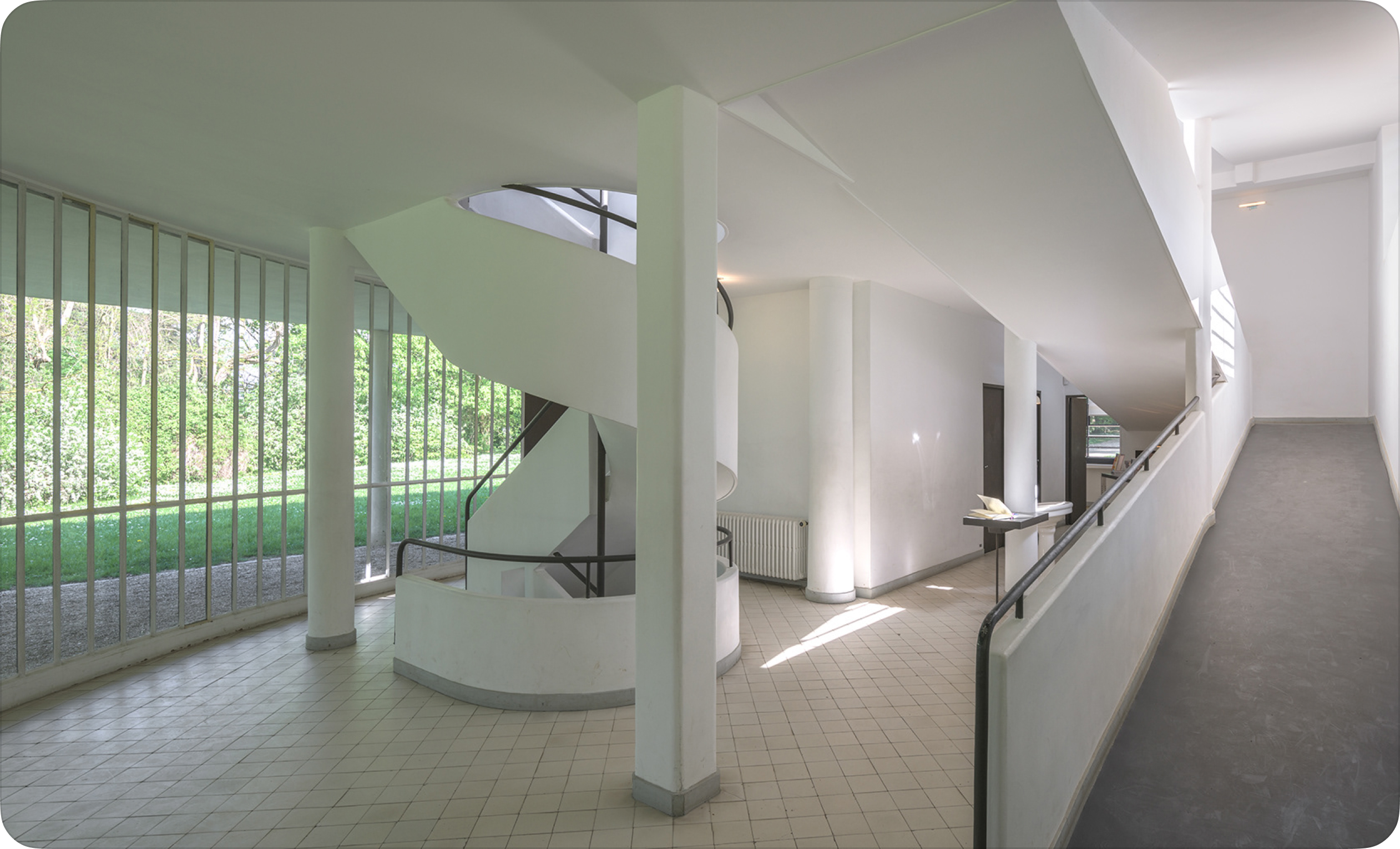
Villa Savoye Entrance – Le Corbusier
When we move into a new house, we naturally explore, eager to map out where every room is and where each hallway and door leads. This curiosity drives us to connect with the space, making it feel like our own.
Similarly, in interfaces, it's important to give people the freedom to explore and develop their own understanding of the layout. By allowing them to create their own mental map, you guide them on a journey of discovery, where context clues shape a personal and meaningful experience with the interface.
What if Villa Savoye had a tab bar?
Imagine walking into the entrance of Villa Savoye, only to be confronted by a fence with five doors labeled: kitchen, bedroom, bathroom, storage room, dining room. Would you enjoy the space or appreciate the architecture? Would you feel a connection to the space? Is knowing the location of the storage room as important to a guest as knowing where the dining room is? Most likely, you wouldn't want to live in or engage with a home designed this way.
This is what a tab bar does.
It reduces all the spaces of the interface into the same priority and importance. For your user, is settings the same importance as the feed?
Feed, Camera, Search, Reels, Profile are all equal importance
What does this mean for interfaces?
Design more context clues, not tabs. Enabling discovery and mastery is one of the best ways to have someone connect with your interface. By gradually revealing complexity, you empower people to feel in control, fostering a deeper resonance between the interface and the UI elements.
It's also fun to see how actions change the interface as you discover new areas. The interface becomes alive.
Navigating the space of [untitled]
Not all tabs are bad.
I'm not against tab-like navigational patterns. Tabs that allow a user to navigate the same set of information more quickly through categorization is extremely useful – like this business card rolodex.
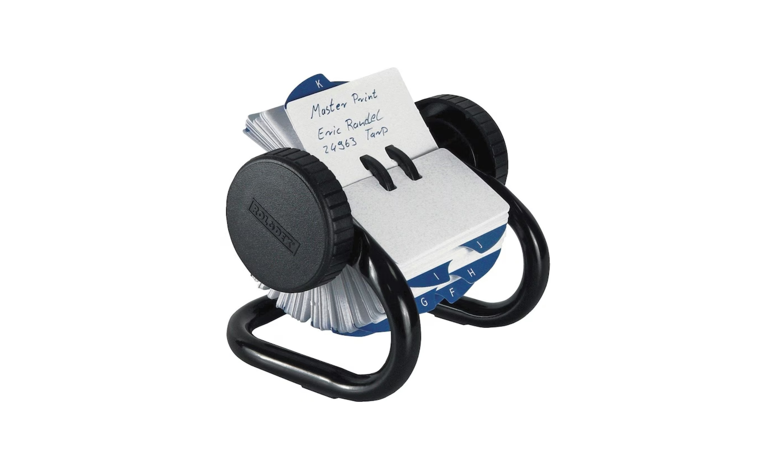
Business card rolodex
In the same way, using tabs (or pills) to filter through the same type of context is an extremely useful tool.
Closing thoughts.
I understand that the tab bar is highly effective in promoting efficiency and driving usage growth—attributes that product teams eagerly seek. This is likely why the tab bar is so consistently used; it provides a straightforward way to quickly switch contexts within an app without overcomplicating the interface.
But I encourage you... as the designer to think about the most inspiring experience for the user. If we designed for efficiency, we'd lose out on the beauty of design – we'd all live in homes that look like a box. We can always create optimized apps. But we won't always have the chance to craft apps from first-principles.